Redesigning Search: Enhancing Discovery and Navigation
A strategic UX overhaul to improve search usability, streamline browsing history, and surface trending suggestions that connect users with what they want faster.
What was done
Identified issues through data analysis
Researched benchmarks for best practices
Reviewed of architecture
Enhanced search field usability
Reorganized category structure

First view
The main goal of this project was to improve the architecture and navigation of the e-commerce search area, which was underperforming in terms of user engagement and results. From a business perspective, there was a clear intent to boost product visibility and, ultimately, increase sales. Interestingly, data showed that this was one of the most clicked areas in the mobile commerce experience, highlighting its strategic potential. This made sense within the broader user behavior: while the homepage served to surface new arrivals, many users accessed the app already knowing what they wanted to buy, turning the search function into a key entry point.
The project had tight deadlines due to upcoming key sales dates, which required the team to move quickly while staying aligned with technical constraints. Some limitations came from existing component libraries and backend capabilities, demanding close collaboration with engineering to ensure feasibility. Despite the time and tech restrictions, the focus remained on creating a smoother, more intuitive experience, while giving high-visibility products the space they needed to stand out in the user journey.
The process
To better understand user behavior, we analyzed Hotjar data, leveraging the advantage of having high traffic volume due to the app’s web integration. One key insight was that users spent, on average, one minute on search-related screens, giving us a limited but critical window to present information clearly and guide decision-making.
The bounce rate in this area was 8%, meaning a notable portion of users were exiting the app after entering the search flow without choosing a path forward. When looking at the most searched products, electronics and home appliances stood out, especially items like smartphones, TVs, and microwaves, highlighting a need to tailor the experience to these high-interest categories.
Analysis
In addition to analyzing user behavior through data, we closely reviewed the existing flow to identify usability and navigation issues that could be impacting the overall experience. This step was essential to highlight areas of friction, such as confusing paths, unclear interactions, or overwhelming content. By mapping out these pain points early in the process, we were able to propose targeted improvements that made the experience more intuitive, streamlined, and effective in guiding users toward their goals.

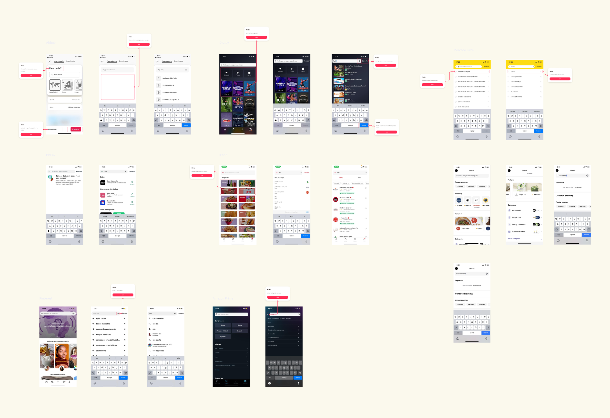
To better inform our design decisions, we conducted a focused benchmark analysis of search experiences across various leading e-commerce and marketplace apps. The goal was to observe how different platforms structure their search components, organize results, and guide users through suggestions and trends. We paid particular attention to patterns related to search behavior, the hierarchy of content, and how each product used visual and textual elements to support fast, goal-oriented navigation.
This research helped us uncover valuable insights into user expectations and mental models when interacting with a mobile search experience. We identified common interaction patterns, such as search suggestions appearing after one or two keystrokes, clear recent searches, and category grouping, that contributed to more efficient decision-making. These learnings directly influenced the direction of our design, allowing us to adapt best practices to the specific goals and constraints of our platform.
Benchmark
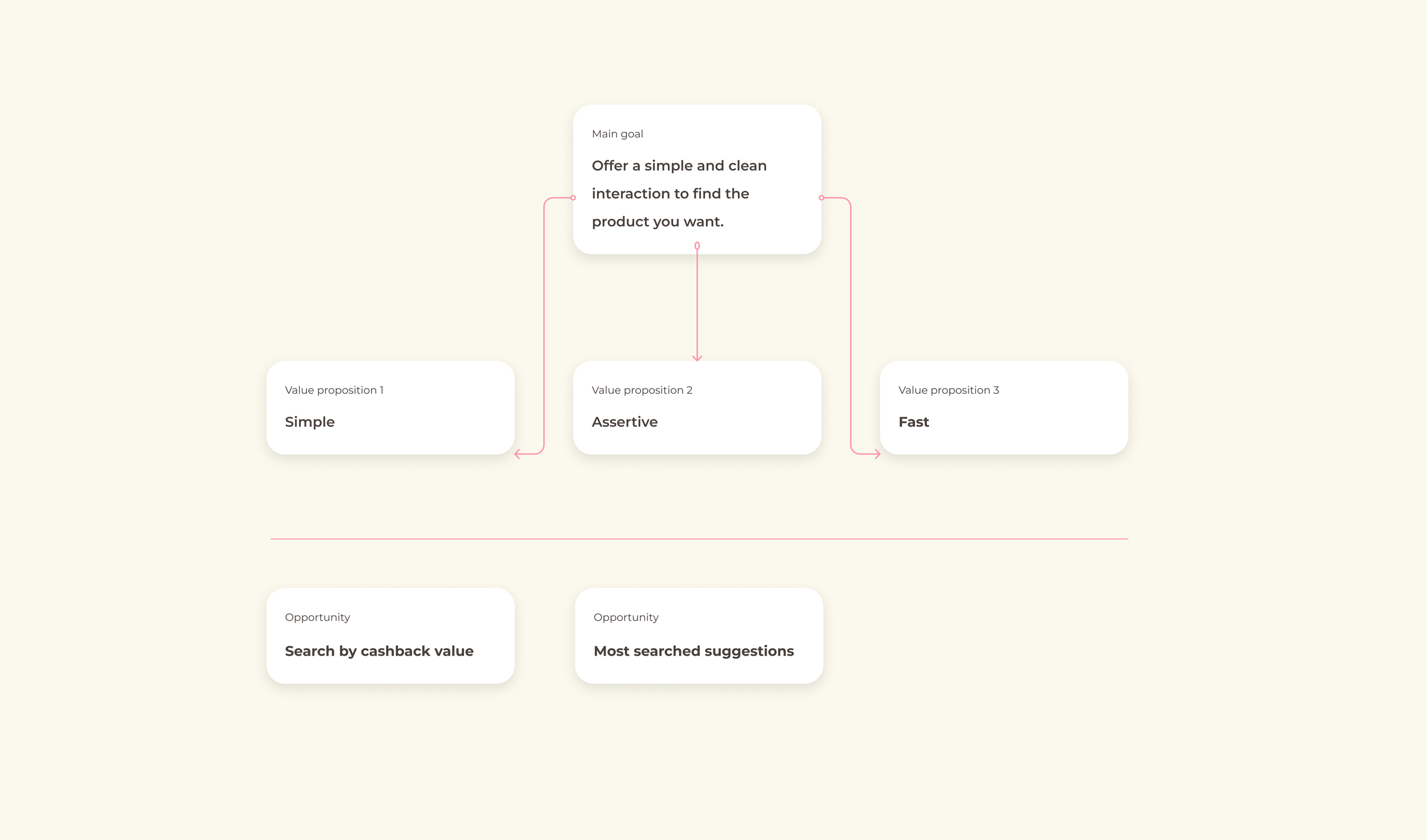
The new proposal for the search area was guided by three core value propositions: simplicity, assertiveness, and speed. Our main goal was to provide a straightforward and clean experience for users to quickly and confidently find the products they’re looking for. These principles helped shape decisions around layout, interaction, and visual clarity, ensuring that users could reach relevant results with minimal friction.
Among the identified opportunities, the option to search by cashback value, one of the company’s flagship benefits, was noted as highly relevant, but due to its technical complexity, it was prioritized in the backlog for future implementation. On the other hand, implementing most searched suggestions emerged from data analysis and benchmarking of best practices in the market. It was incorporated into the new solution as a way to accelerate discovery and support more assertive navigation through search.
Proposition
Delivery
The final proposal for the search area introduced a more engaging experience by shifting the search place holder wording into a question format. This approach was designed to prompt users to interact more intuitively with the input, as if answering a question rather than typing a command. To support the cross-sell team's goals, we also implemented a dynamic banner section to highlight active promotions, aligned with media campaigns. This space was later standardized in collaboration with the marketing team to ensure brand consistency.
Additionally, based on the most searched terms, we created a section featuring top trending topics to capture user interest and help them quickly access relevant content. This addressed a significant portion of user needs and made room for seasonal or viral trends. Product categories were also reorganized to streamline discovery through grouped items, reducing the effort needed to browse across departments and improving overall navigation clarity.

When users tap the search field, recent search suggestions based on their previous queries are displayed. This allows them to easily pick up where they left off without the mental load of recalling terms or wasting time retyping. In a highly competitive e-commerce landscape where users often compare prices across platforms, this feature supports continuous shopping and improves the likelihood of conversion.
As users begin typing, the system offers autocomplete suggestions to reduce effort and time, while also surfacing potential product results directly under the query. This speeds up the path to product discovery and supports more assertive decisions. Although the existing search filters were maintained, we introduced a new filter for "free shipping", a highly requested feature, to increase relevance and align with user expectations.
