Limit Expansion
Improving Credit Access through Clearer Journeys and Strategic Communication
A data-driven redesign of Mercado Pago’s limit increase experience, focused on cultural behavior, simplified flows, and personalized messages to boost user engagement and access to credit in Brazil.

What was done
Entire analysis of complex usage users cases and journey map;
Improvements in the flow of limits request;
New messages for users requests;
Guidelines for communications about limit;
Outcomes
Users with limit improvement*
More requests on app about better limits and increase of limit concession
NPS*
better numbers after deliveries
Some numbers have been hidden*First view
Mercado Livre is a technology company with a major focus on marketplace, an online shopping website where millions of sellers and retailers advertise products. It has over 211 million registered users in Latin America, making it the 5th most visited website in Brazil.
To make possible the purchases and the financial life of users, the company has Mercado Pago, where sellers can receive the amounts from their sales or anyone can make payments, transfers and also access to credit to buy products from the marketplace or receive money on their account to use as they wish.
The number of fintechs in Latin America has grown significantly. According to the Inter-American Development Bank (IDB), there are more than 3,000, with a growth of 340% in the last 10 years. This growth has made it much easier to user's diversify the source of credit, allowing them to have multiple options at the same time. Access to credit, especially when it is really needed, is a way of making things viable, creating a relationship of trust with the fintech. In Latin America, the relationship with credit can vary from country to country. In the case of Brazil, access to credit is often related to how much the company “likes” you, making loans or cards available.
This was the first project I worked on at Mercado Livre, and it came with high expectations, as credit limit increases and the responses we provide to users have a direct impact on the company’s contact rate. The work involved numerous credit analysis rules combined with the complexity of the company’s information sources. To deliver the best possible experience, we had to deeply understand how the credit analysis process works and closely collaborate with the risk and tech teams to maximize our chances of achieving strong results.
How we worked
In Brazil, access to credit plays a crucial role in people’s financial lives. One major cultural factor is the widespread habit of dividing payments into monthly installments, making credit not just a convenience but a necessity for many. This behavior has deeply influenced how users interact with financial products and set expectations around availability and ease of access. As a result, any friction in the credit experience can directly affect engagement, satisfaction, and trust in the platform.
However, even when users maintain an active financial relationship with a bank or fintech, credit approval is rarely straightforward. Granting credit relies on having a comprehensive view of a user's financial behavior across the broader ecosystem, not just within a single company. Credit assessors require accurate and complete data to make responsible decisions. Without visibility into income patterns, payment history, and risk exposure, even well-intentioned users may struggle to access the financial products they need.
Despite being willing to share data, many users drop out of the credit application process due to complexity, confusion, or lack of perceived value. In particular, document submission flows often create barriers. Users might not understand why the documents are needed, or they may perceive the effort required as too high compared to the potential benefit, especially when the return on their action isn't clearly communicated. This disconnect between user expectations and system requirements leads to high abandonment rates and missed opportunities for both users and the business.
To address this, we performed a detailed analysis of the entire user journey related to credit limit increases and data sharing. Using heuristic evaluation combined with search behavior data, we identified key drop-off points and friction areas. We then layered these insights with findings from prior user research to uncover patterns and validate hypotheses. This approach allowed us to diagnose issues at the root, rather than treating only the symptoms, resulting in a more strategic and targeted redesign of the experience.
Problem statement and definition
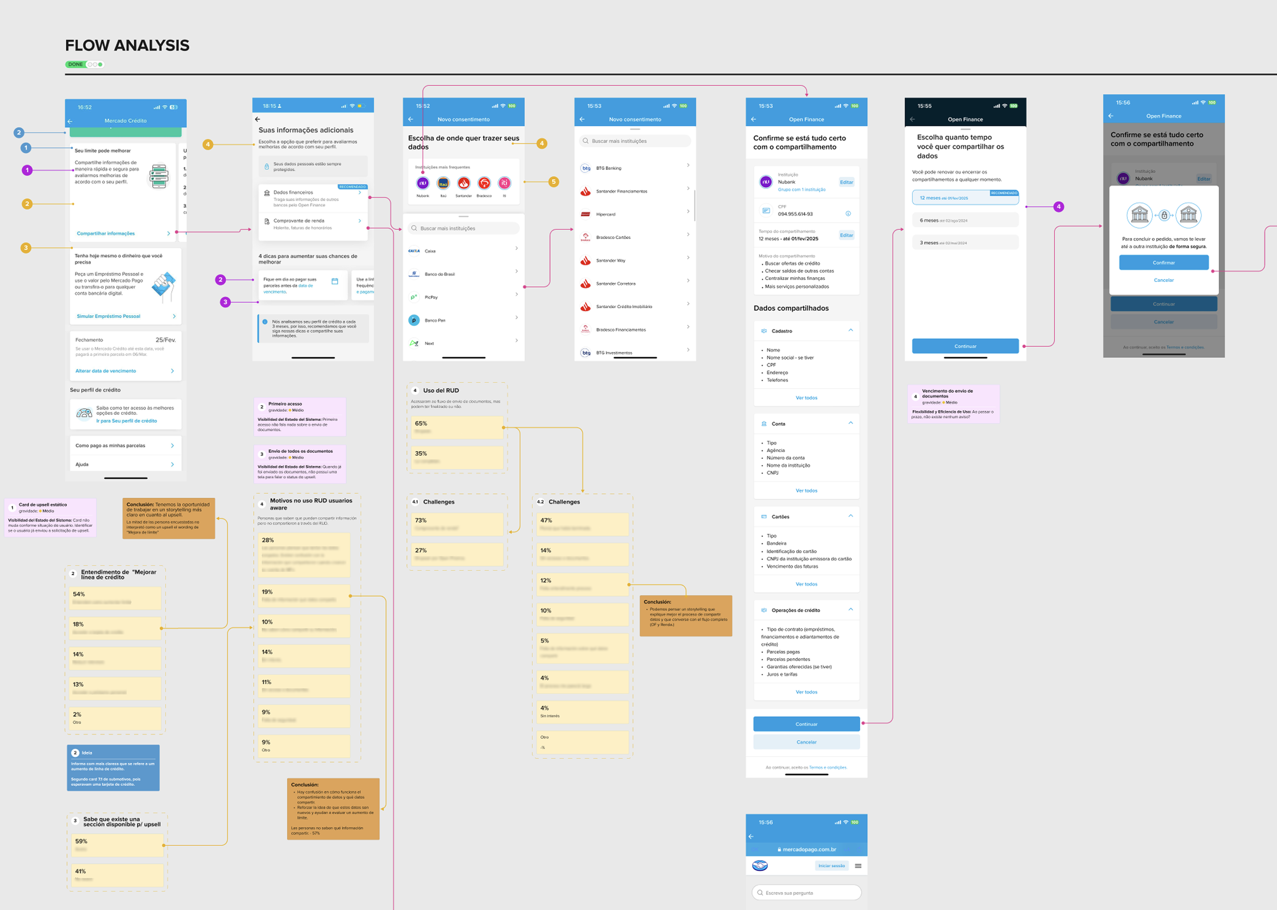
Given the complexity of the different paths users could take to share their information, and the many initiatives layered over the years to address various needs, mastering the full scope of user journeys became a major challenge. We collaborated closely and intensively with stakeholders to map every possible scenario onto a shared canvas, ultimately building a flowchart that was intuitive from the user’s perspective. This holistic approach not only gave us a clear overview of the journeys and revealed critical inconsistencies, but it also enabled us to validate key assumptions before moving into screen design. Additionally, the detailed flow became an essential reference for cross-functional teams, especially engineering, ensuring a shared mental model and greater alignment throughout the product development process.
Flow definitions
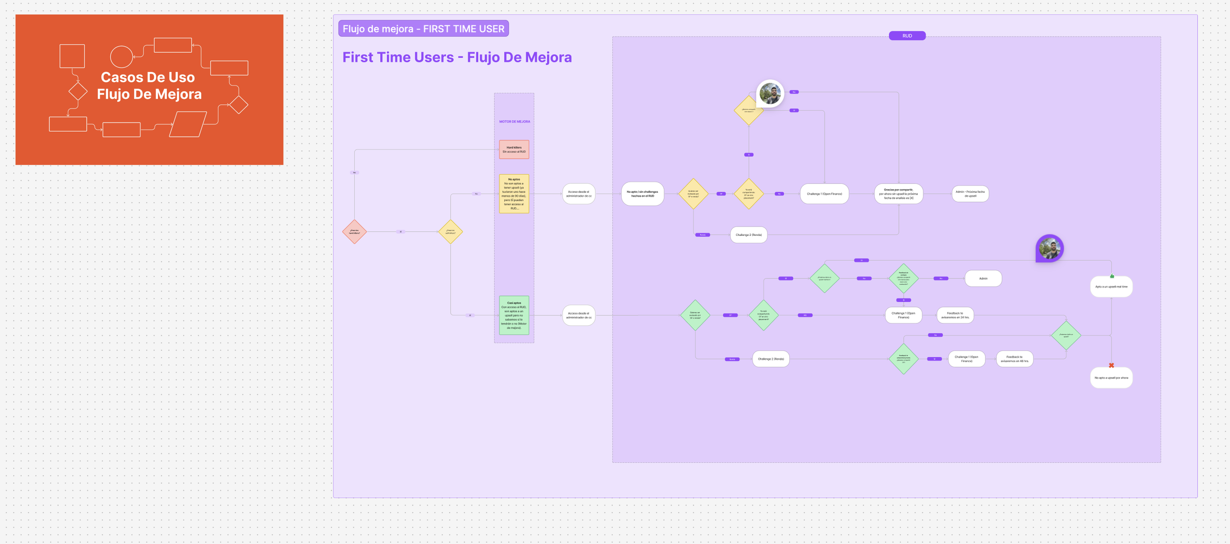
Delivery
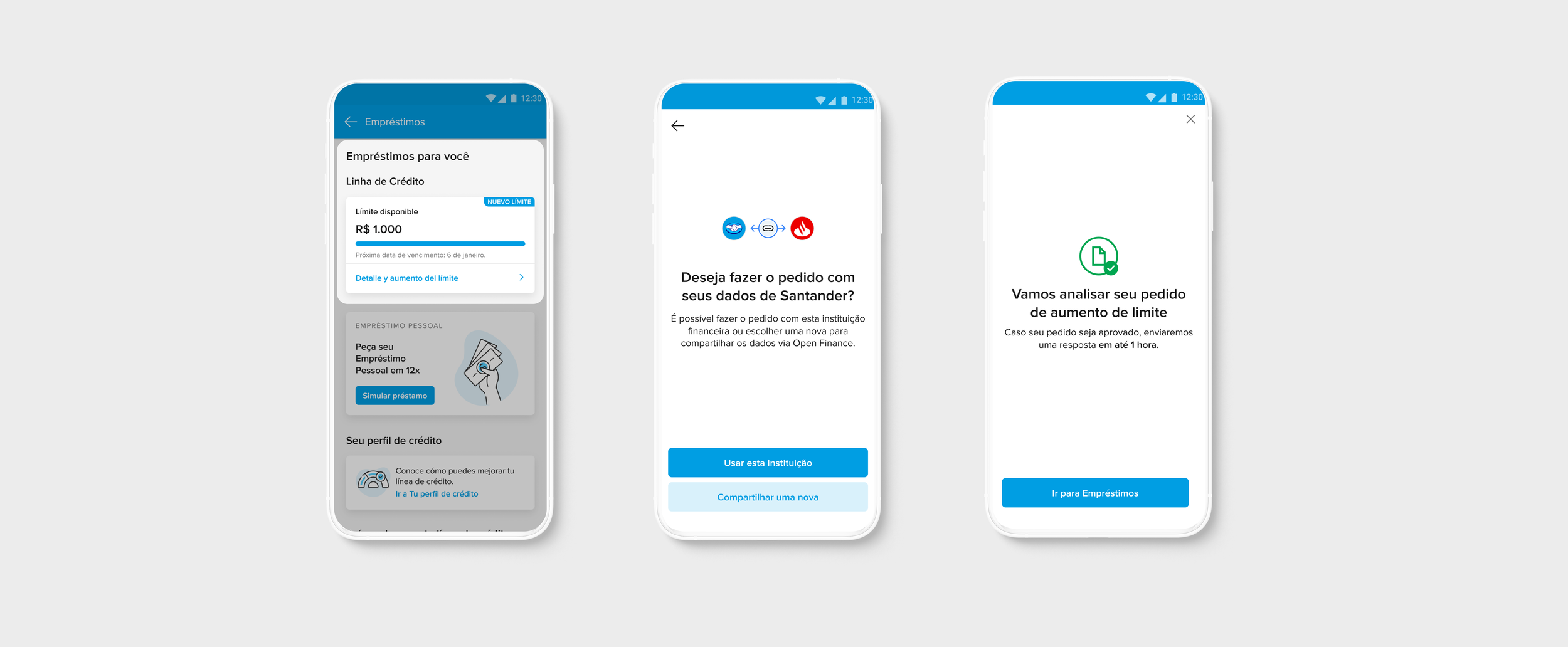
In terms of deliverables, the flow brought improvements that better linked the action of asking limit with the sharing of information. In addition, we recommended to users easier actions for sending documents to avoid abandonments when entering the flow, in addition to showing only the options related to that user, being preciser and increasing the chances of upselling.
Data played a fundamental role in shaping these decisions. In Brazil, Open Finance is not just an industry initiative, it’s a regulatory framework that enables users to consent to sharing their financial data across institutions. We leveraged this existing data infrastructure to streamline the experience: instead of requiring users to re-enter or resubmit data already available through Open Finance, we enabled them to quickly review and choose which financial institutions they wanted to connect. This approach reduced repetition, saved time, and increased user autonomy, key factors in building trust.
We also addressed visual complexity by making pragmatic choices around personalization. Initially, the idea of representing every financial institution with a custom logo seemed unmanageable, especially considering the volume of institutions in Brazil. However, after analyzing usage data, we realized that a vast majority of users were concentrated in a relatively small set of banks. By prioritizing visuals for the most-used institutions and using a generic fallback for edge cases (representing less than 5% of the base), we struck the right balance between scalability and clarity.


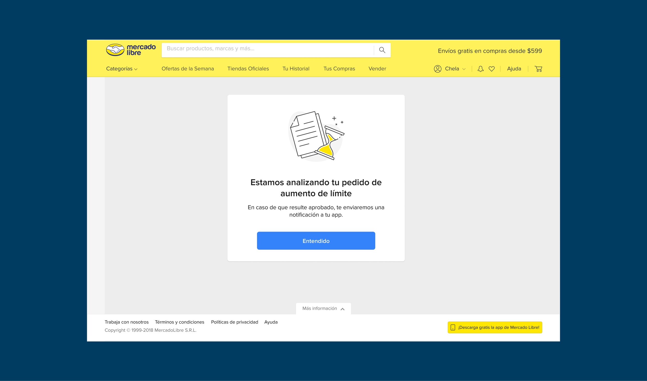
To guide users throughout the journey, we introduced contextual messaging designed to empower rather than frustrate. An appropriate response helps the user know what actions to take and how to get around the situation. If you are unable to complete your request, the reason for not being able to continue needs to be clear, so that you do not believe that you are being penalized and have temporal visibility.
Being objective and transparent over time were guidelines for communications, providing clear deadlines for responses, in addition other points of contact such as email were added to the experience notify the result of the request.
About the accessibility, definitions for screen readers bringing the appropriate message were added. Other handoff plus was a clear alignment with technology to keep the design definitions respected and facilitating the quick identification of spacing and other UI details. This project included both the mobile and the web experience.