The Cashback Evolution: Guiding Users Through Change

UX Design for Clear Communication and Seamless Transition to a New Cashback System
What was done
Improved complex flows for credit and cashback with cross-team collaboration.
Simplified document steps and used open finance to personalize.
Ran research with 15k+ users and interviews to validate naming.
Designed and tested mobile experience with focus on clarity and access.
Created a guide to align teams and standardize communication.
First view
This project was part of a broader strategic shift in the way cashback operated within PagBank ecosystem. Previously, users would receive cashback as direct money deposited into their accounts, available to spend freely. With the goal of boosting engagement across multiple applications and expanding users' access to credit, the model evolved: cashback would now be issued as a credit, usable as a payment method either individually or in combination with other payment options. This transformation introduced a new level of complexity, as it required the product to be perceived not only as a reward, but as an integrated benefit across different services, all aiming to strengthen user retention and deepen engagement within the digital account environment.
Faced with this challenge, our UX strategy centered on transparency and empowerment. It was essential to clearly explain the new functionality to users, preserving their trust while setting the right expectations. At the same time, we designed user-friendly tools that allowed individuals to easily manage the cashback credits they earned, providing flexibility and control. By aligning communication and product experience, we maintained the original perception of value while encouraging users to explore new financial services, making the transition feel natural and reinforcing loyalty within the ecosystem.
7
company products using the benefit
moments of interaction with the benefit
25
75%
of users do not know the meaning of the term
RESEARCH
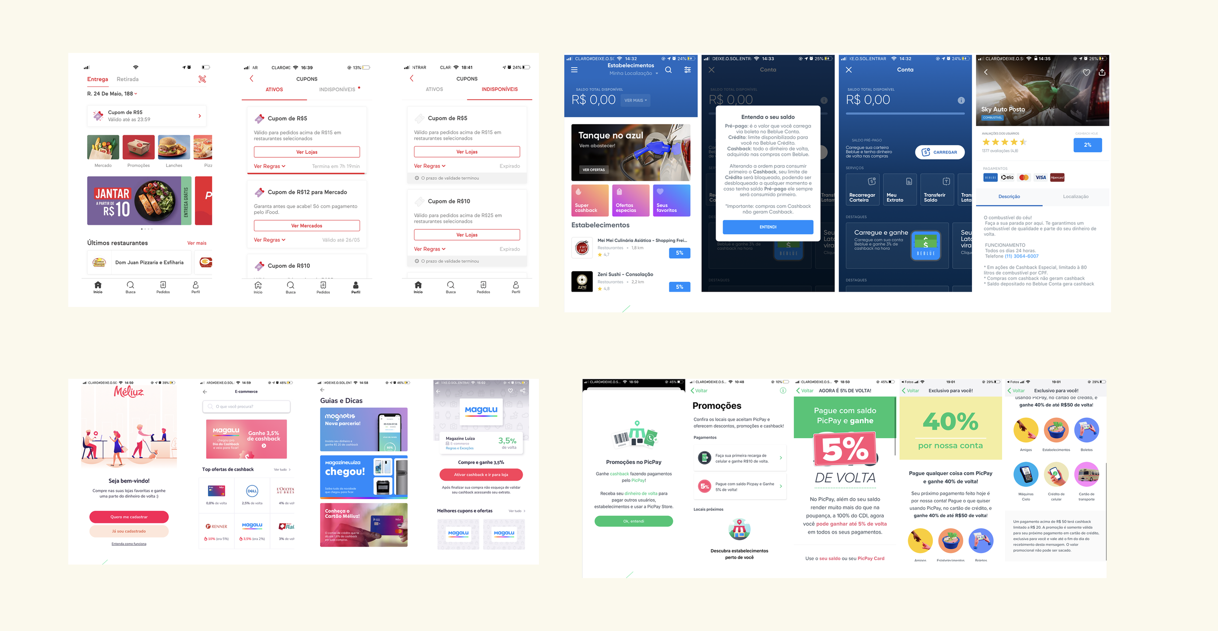
To better understand how users perceived and interacted with the cashback feature, we conducted a large-scale quantitative survey with over 15,000 participants, complemented by in-depth qualitative interviews with 13 users. Throughout the research, we uncovered that many users struggled with English terms, often finding them difficult to pronounce and fully comprehend, even when using other applications offering similar benefits. These insights highlighted the need to test the product’s name itself to ensure it resonated clearly with our audience. We initiated a naming research process to evaluate whether "cashback" was truly the most suitable term or if alternative names would better align with user expectations and language familiarity. A detailed overview of the naming research methodology can be found in this Medium article.
Cashback is one of the favorites among financial benefits
1° Cashback - 49%
2° Discount on fees - 21%
3° Discount on bill payment - 8%
Customers who don’t know it associate it with other names.
The term “cashback” is commonly used across the market, but user understanding and adoption still depend on their learning process—connecting the term to the actual value it brings. This highlighted the need for clear, contextual communication to support that understanding.
Benchmark done around 2019Ideation

For this project, we organized a co-creation session in collaboration with the product, IT and design team located in Uberlândia - MG, Brazil. This collaborative workshop was essential in aligning different perspectives early in the process, encouraging cross-functional input and shared ownership. During the session, we worked together on initial wireframes and gathered strategic suggestions for the product experience. These early concepts served as a foundation and were later refined through iterative design work, ultimately guiding the development of high-fidelity interface designs that aligned with both user needs and business goals.
Prototyping
In this project, I collaborated closely with UI Designer Mariana Bossert. One of the major challenges in prototyping was addressing the multiple touchpoints where users could interact with the benefit, as well as how they would manage their received cashback. To ensure our solution was clear and addressed key user concerns, we conducted two rounds of usability testing at different stages of the design process. The first round focused on understanding the benefit as a motivational element for converting users into other products, helping us refine communication and positioning. The second round took place once we had defined the balance and transaction history areas, allowing us to evaluate users’ comprehension and their ability to effectively manage the values associated with their cashback.
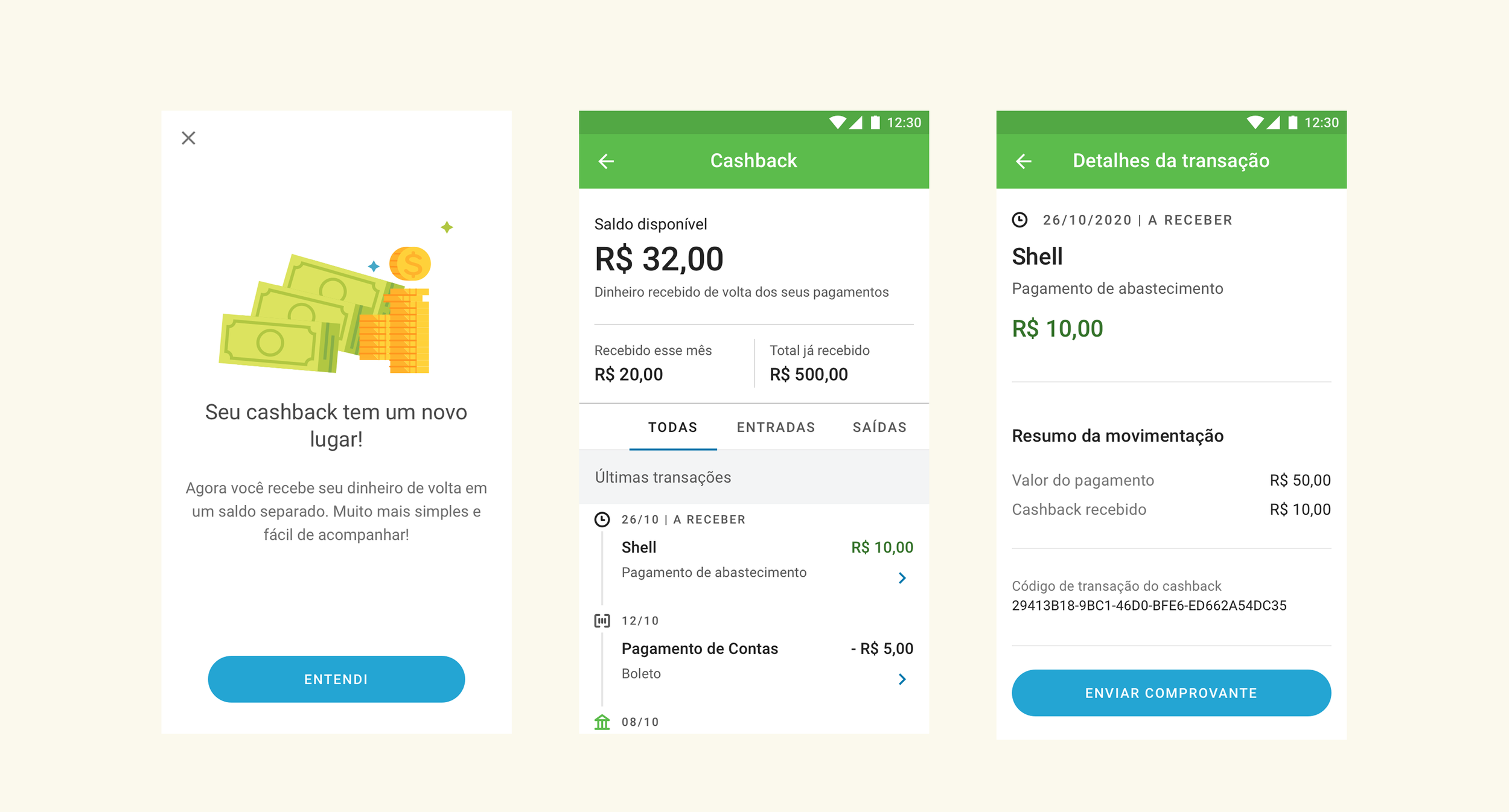

Results and internal guidelines
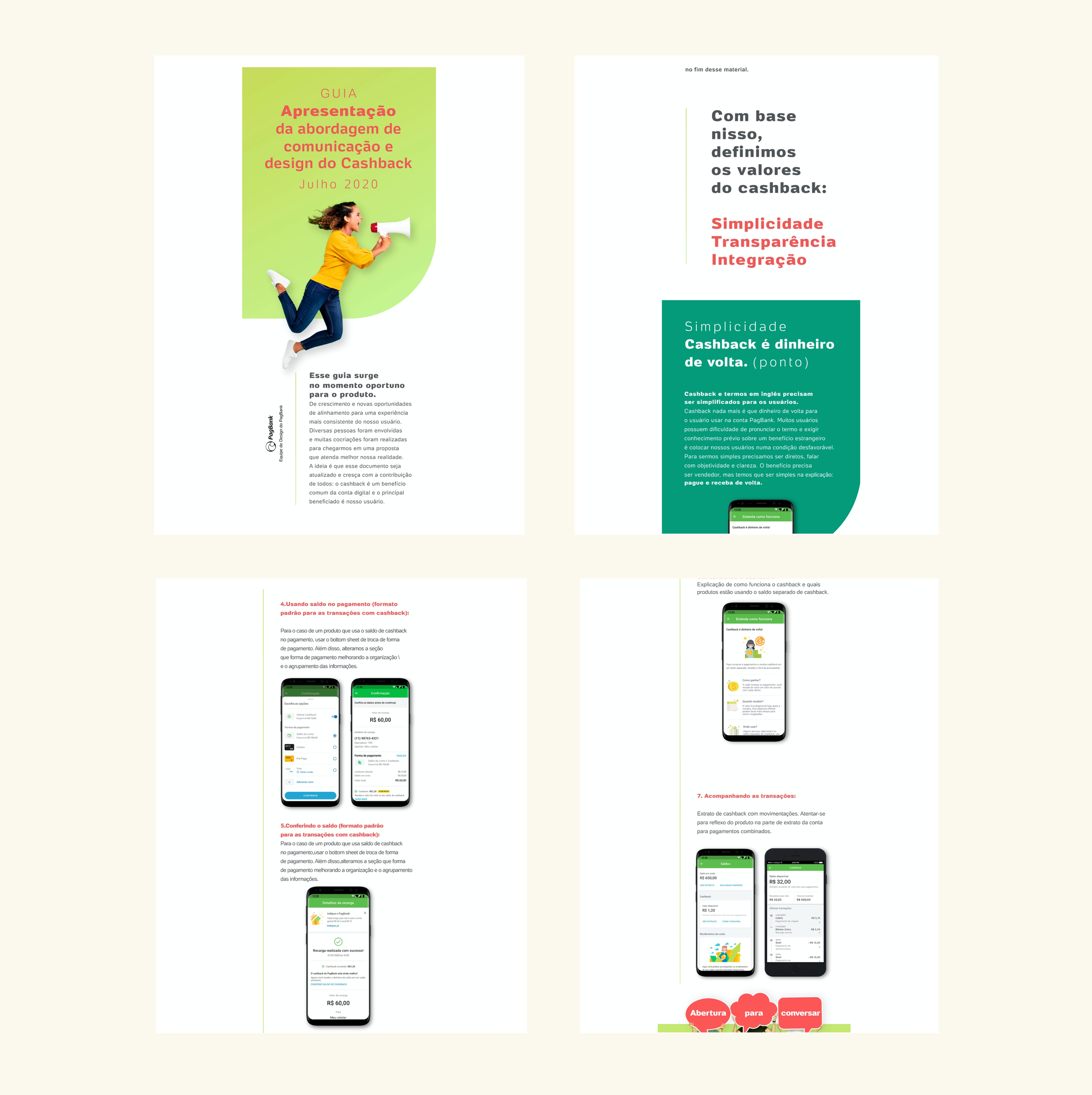
To support alignment across all teams involved with the cashback experience, we developed a comprehensive Communication and Application Guide. This document served as a living resource, continuously updated with the latest value propositions, usage instructions, and best practices, particularly around how to communicate foreign terminology like “cashback” in a way that’s clear and culturally appropriate for our users. The guide also outlined how the benefit connects with other products in the ecosystem, reinforcing its role in driving engagement and retention. To ensure long-term consistency and collaboration, we established a network of product “guardians”, key stakeholders responsible for maintaining synergy across initiatives and acting as reference points for consultation whenever needed.
Although our biggest concern was a potential decrease in revenue due to the introduction of the extra credit limit—especially considering that the new communication strategy included warnings about possible overspending—the financial results were encouraging. Our hypothesis was that greater transparency could lead users to engage more consciously, and in turn, build trust in the product. The project was successfully launched in December 2020 within the app, and early metrics showed that responsible usage did not hinder revenue performance. On the contrary, the clearer messaging and user empowerment around financial decision-making proved to be a positive driver for product adoption..
+58%
total amount of cashback granted to users
+78%
number of users who received cashback
The more teams involved, the greater the complexity.
As the number of stakeholders grows, so does the challenge of aligning everyone. Managing design deliveries across multiple teams is essential to ensure the full experience makes sense from the user's perspective.
Create flexible standards that cover as many scenarios as possible.
You won’t predict every edge case. But by designing components and interfaces that support a wide range of needs, you reduce rework and ensure consistency as the product evolves.
What makes sense to designers doesn’t always make sense to users.
Just because certain English terms feel natural to us doesn’t mean they work for everyone. We need to meet users where they are, using clear language and taking responsibility for making complex concepts simple.